Next Chapter Tutoring
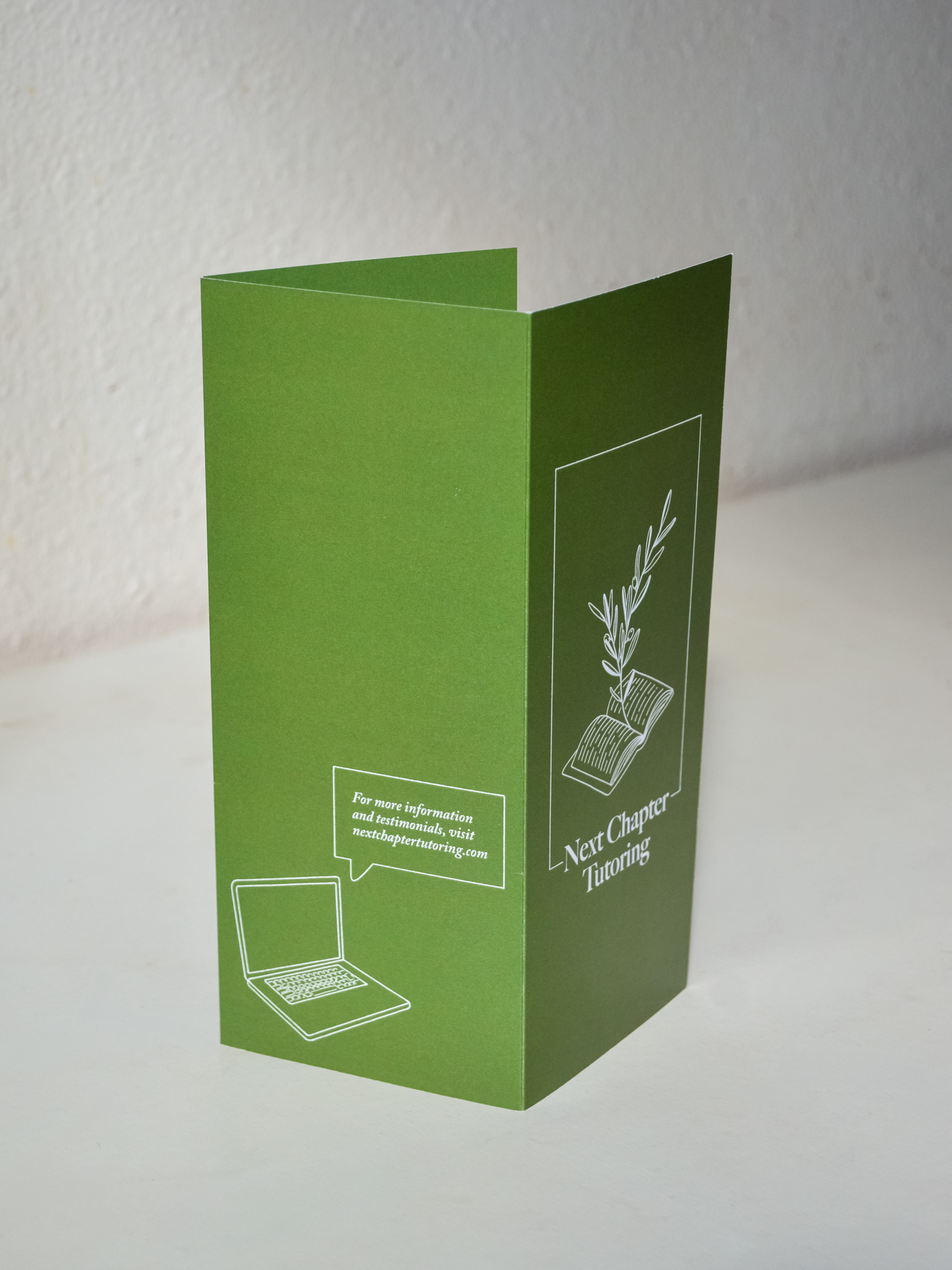
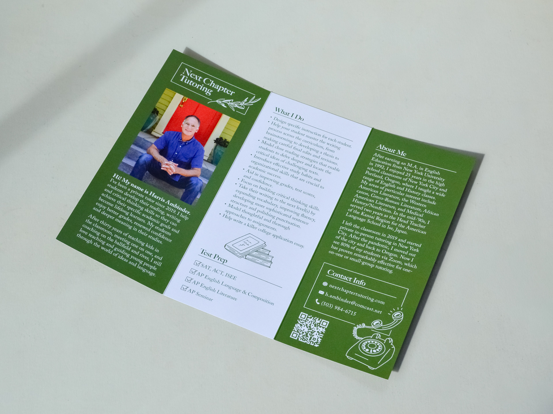
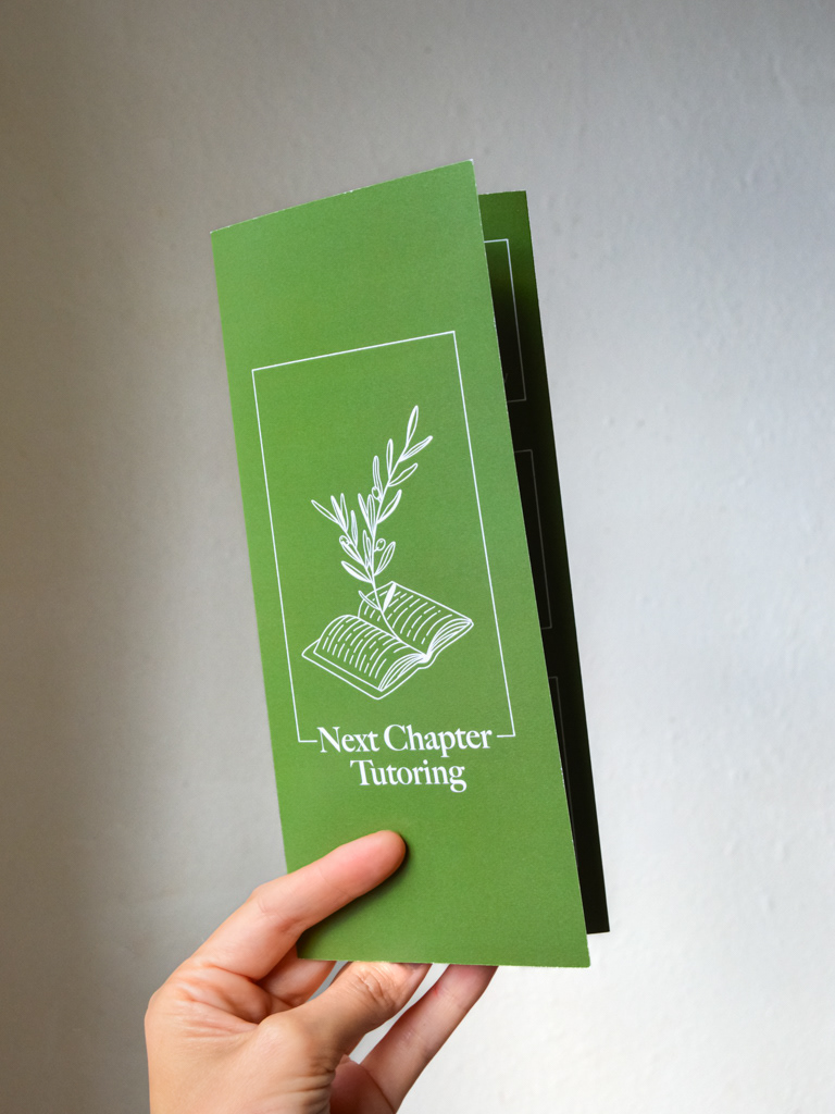
I designed a tri-fold brochure for a client who was expanding his private tutoring business, and needed printed matter to market himself and reach parents and guidance counselors. The design had to be mature, with just a little bit of playfulness, while alluding to the elements of scholarly study. I chose a serif typeface because the client is primarily focused on English language and literature and wanted direct and indirect references to reading and books. He is located in Portland, Oregon, where the culture is easy going, quirky, and loving of nature, so I chose to do simple line drawing illustrations and a palette of green and white to speak to this.
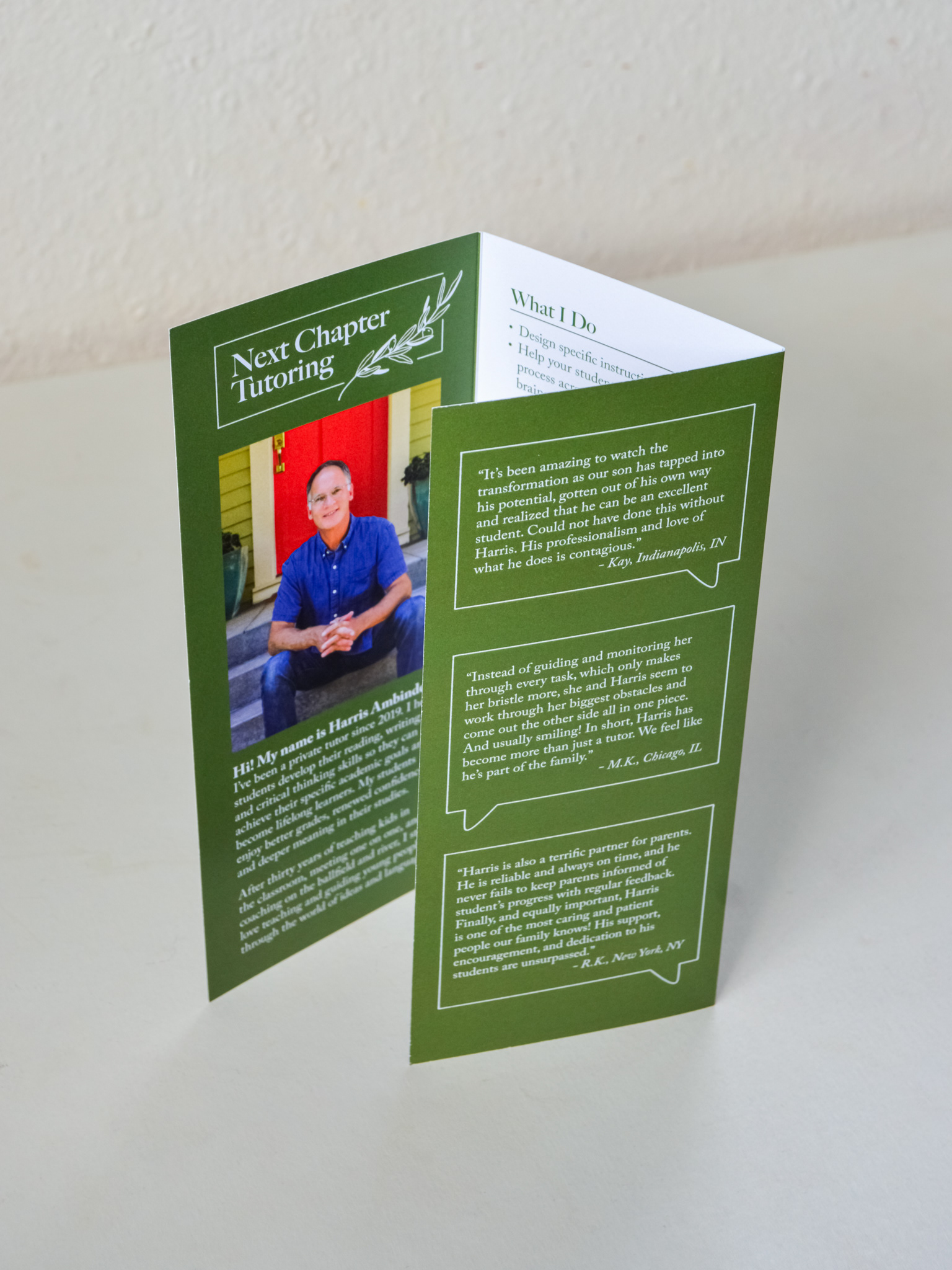
While the aesthetic goals were important, it was just as crucial to have a final product that was easily legible and well laid out, so I tested the design countless times along the way, and worked closely with a professional print shop to make sure everything worked well and looked great. The client was very happy with the result and the brochure has been put into action!